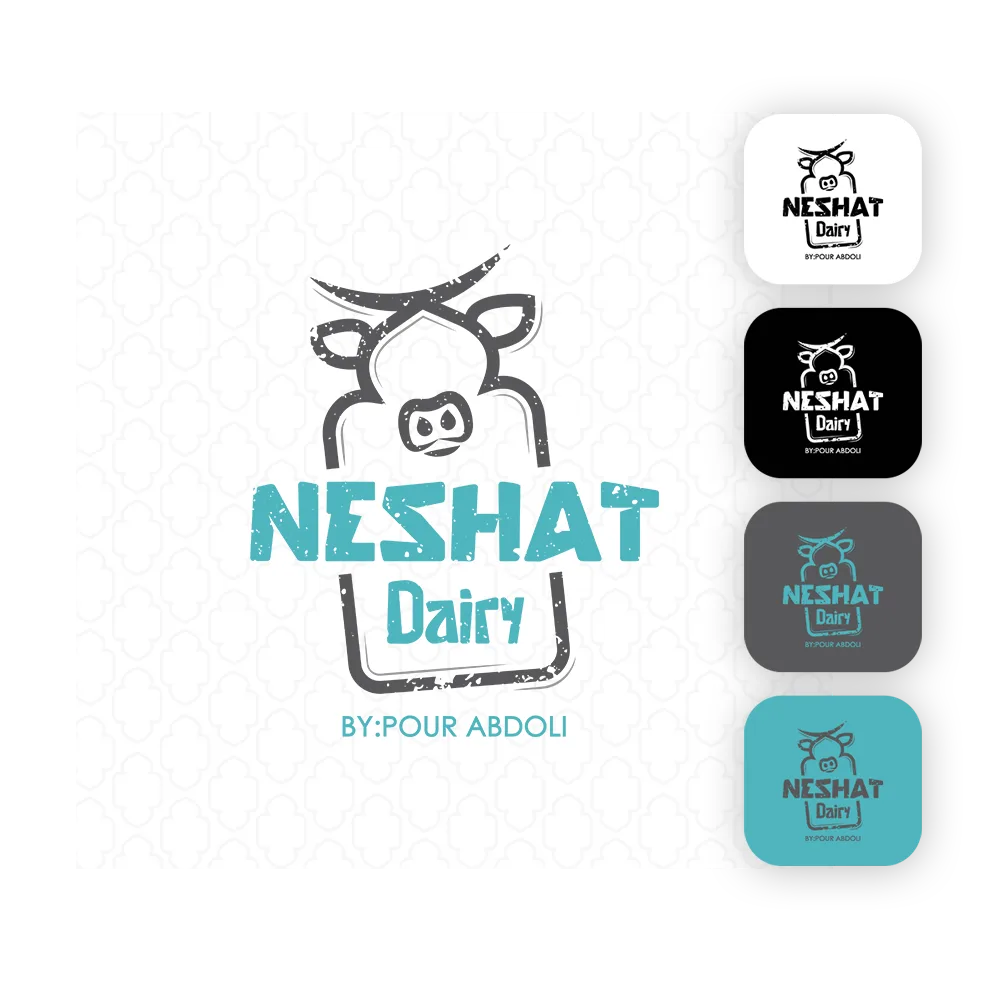
The logo of Neshat Dairy is inspired by the natural form of flowing milk, fresh leaves, and earthenware bowls.
Its soft, symmetrical, and minimalist design evokes purity, freshness, and health in dairy products.
The logo symbolizes the connection between pristine nature, authentic nutrition, and the joyful vitality of fresh dairy.
Just as a glass of milk brings calmness and energy to the body, the Neshat logo conveys trust and warmth to the audience.
Color Palette Presentation
The color palette of Neshat Dairy is based on the primary color #4fb5be (soft turquoise / blue-green).
This color represents freshness, purity, the calmness of water and natural coolness, evoking health and freshness.
Alongside it, complementary colors like milky white and very light beige are used, symbolizing the purity of dairy products and the simplicity of nature.
This color combination creates a cool, pleasant, and trustworthy atmosphere for a modern and healthy dairy brand.
Color Palette Presentation
The color palette of Neshat Dairy is based on the primary color #4fb5be (soft turquoise / blue-green).
This color represents freshness, purity, the calmness of water and natural coolness, evoking health and freshness.
Alongside it, complementary colors like milky white and very light beige are used, symbolizing the purity of dairy products and the simplicity of nature.
This color combination creates a cool, pleasant, and trustworthy atmosphere for a modern and healthy dairy brand.